CSS Grid vs. Flexbox vs. Bootstrap: Which One is Best for Your Next Project?
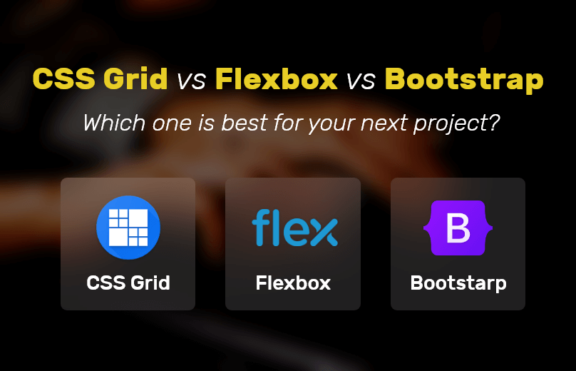
Table of Contents
- What Is CSS Grid?
- How Does CSS Grid Work?
- What Is Bootstrap?
- How Does Bootstrap Grid Work?
- What Is Flexbox?
- How Does Flexbox Work?
- CSS Grid Vs. Bootstrap
- Which One Is Better?
- The Base For Comparison
- Detailed Comparison
- Similarities
- Browser Support And Compatibility
- Conclusion
So what constitutes a web page? Even the most basic web pages require a few headings, paragraphs and navigation bars. To simplify the development and maintenance of web pages, responsive layout models are developed.
Bootstrap, CSS Grid and Flexbox are some of the popular and widely used models across all platforms and browsers. web development services leverage each platform to come up with user-friendly and functional websites and web pages.
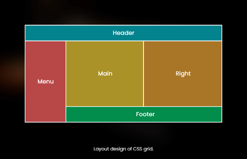
What Is CSS Grid?
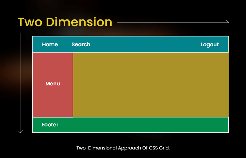
With CSS grid, you can quickly develop flexible and two-dimensional layouts. CSS grid offers a two-dimensional grid-based layout system. While working with CSS Grid, there is no need for developers to use floats and positioning.
How Does CSS Grid Work?
CSS grid works by segregating a page into major portions. It is also adept in defining the relationship in terms of size, position and layer. Like tables, CSS Grid allows the developer to align elements into rows and columns.
What Is Bootstrap?
For website development services, Bootstrap is the most popular CSS framework. It is one of the best frameworks for developing responsive and mobile-first websites. In case you don’t know, Bootstrap 5 is the latest version of Bootstrap.
The main purpose of using Bootstrap is because it comprises various options related to colors, size, fonts and layouts. In other words, developers tend to have more flexibility while working with Bootstrap.
How Does Bootstrap Grid Work?
To align and layout, the Bootstrap grid system relies on a series of containers, columns and rows. Note that in Bootstrap, the grid system supports a maximum value of 12 columns. And anything after the 12th column will be shifted to the new line.
Bootstrap is even capable of differentiating screen sizes ranging from extra small to extra-large based on pixels. In Bootstrap, the transition between the various screen sizes is also known as breakpoints. Bootstrap leverages a mobile-first strategy and therefore it is ideal for small screens.
What Is Flexbox?
Flexbox is another layout that can be used to develop responsive web pages. The four layout modes in Flexbox are as follows:
- Inline for texts
- Table for 2D table data
- Block for sections in a webpage
- Positioned for the position of an element
It is important to note here that Flexbox supports all modern browsers. In simple words, it offers a wide variety of flexibility to the developers. To start using this Flexbox model, you have to define the flex container.
Also Read : Top Technologies to Pick for Building Microservices Architecture Development
How Does Flexbox Work?
Quite interestingly, Flexbox promises to save the developers from the disadvantages of simple CSS.
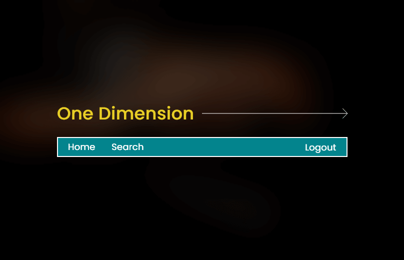
As the name suggests, Flexbox stands for flexible box. It is a layout model aimed for providing you with an effective way to arrange and organize website elements to develop highly adaptive designs. The way Flexbox works is quite simpler on the surface. The lines and items can be manipulated in layout and size along the vertical and horizontal axis.
CSS Grid Vs. Bootstrap
On the basis of markup, CSS Grid sports a cleaner and more legible markup. The grid layout is not defined in the markup but done in the CSS. On the contrary, Bootstrap requires a div tag for each row and for defining the class tier for specifying the layout.
Note that CSS provides users with a flexible layout with no column limitation. In Bootstrap, the grid is divided into 12 columns. CSS Grid is well supported by most browsers and versions. Moreover, the page load speed is usually faster in CSS Grid. On the other hand, Bootstrap slows down the page loading speed as the style sheet supporting files have to be downloaded.
Which One Is Better?
For Mobile App Development, both these models are good. For instance, Bootstrap offers developers more than a grid system. It is a frontend tool kit capable of pulling off complicated and responsive designs.
On the other hand, CSS Grid is a simple and flexible grid layout system. It applies a cross-compatible design and provides your clients with a great user experience. Both CSS Grid and Bootstrap are well based on your preferences.
The Base For Comparison
-
CSS Grid vs. Bootstrap vs. Flexbox
CSS Grid is mostly used where you want to be more rigid about the layout. It is also used in situations where the developers want their content to flow on the page as per the desired layout.
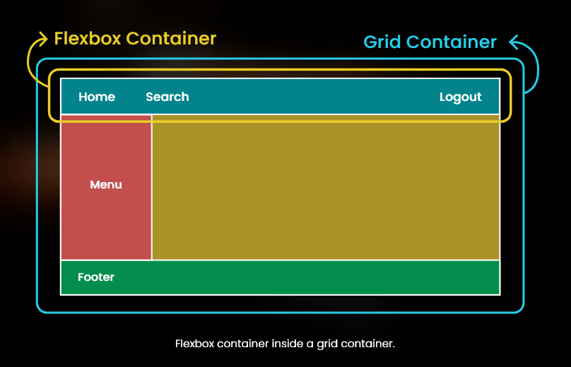
On the other hand, Bootstrap’s grid system is based on the CSS Flexbox layout system. It is worth mentioning here that Bootstrap competes directly with CSS Grid. Flexbox is also a great platform to create responsive web pages. With Flexbox, you can align elements in a container even if you are unaware of the size of these elements.
Detailed Comparison
-
CSS Grid vs. Bootstrap vs. Flexbox
-
Bootstrap
Developed and later open-sourced by a Twitter developer, Bootstrap is an all-inclusive framework that makes including CSS simple and easy. It works by assigning rows and columns as classes to the elements. One of the key highlights of Bootstrap is that it allows developers to leverage the special types of column assignments.
-
Flexbox
As a part of the CSS, it is a set of properties the developers can access within an element when the parent element’s display is set to flex. To be precise, Flexbox is a better option and the easiest way to order elements within a container.
-
CSS Grid
CSS Grid is the most complicated and precise alternative for CSS layout management. If you are showing a lot of information on the screen and want your webpage to be organized, then CSS Grid is your best option.
Similarities
-
CSS Grid vs. Bootstrap vs. Flexbox
The primary similarity between these three frameworks is that they help your webpage to be responsive and user-friendly. If you want to increase the overall responsiveness and engagement of your webpages, you need to rely on these three frameworks.
Browser Support And Compatibility
-
CSS Grid vs. Bootstrap vs. Flexbox
CSS Grid, Bootstrap and Flexbox are well supported by modern-day browsers. As a developer, you should be comfortable using these platforms. With the help of feature queries in these frameworks, developers can make the features compatible easily.
Conclusion
CSS Grids aid in the creation of the webpage’s outer layout. You can build complex as well responsive designs with this. This is why it is called ‘layout first’. While Grid, Bootstrap, and Flexbox can be defined as the parent-children element, both have their own strengths and limitations. Before deciding which one to choose, it’s a good idea to learn about their abilities. Flexbox, CSS Grid, and Bootstrap are responsive layout models that let you make responsive and unique layouts that work on a variety of browsers and devices. You’ll need some HTML and CSS knowledge regardless of which model you choose. In order to get elements to overlap in Flexbox, you’ll need to look at traditional techniques like negative margins, transforms, and absolute positioning. We can place items on overlapping grid lines or even within the same exact grid cell when using the grid.
Find out how our mobile application development services can help you build brand identity. Looking for front-end expertise? Connect with us at biz@multiqos.com and let our experts handle your worries.
Let’s Create Big Stories Together
Mobile is in our nerves. We don’t just build apps, we create brand. Choosing us will be your best decision.

Get In Touch

Get Stories in Your Inbox Thrice a Month.

Cybersecurity for Web Applications: A 2026 Protection Framework for Modern Businesses
Breaking Down Website Development Cost: What Should You Expect?

Why NodeJS for Healthcare is the Go-To Choice for Scalable Health Apps?